Friday 30 September 2011

Alignment

This is an exercise on Alignment. I have take the same information and used different layouts/justification to create different effects. Different leading has also been use to suggest what the text is describing. The layouts focus on different aspects within the same text.


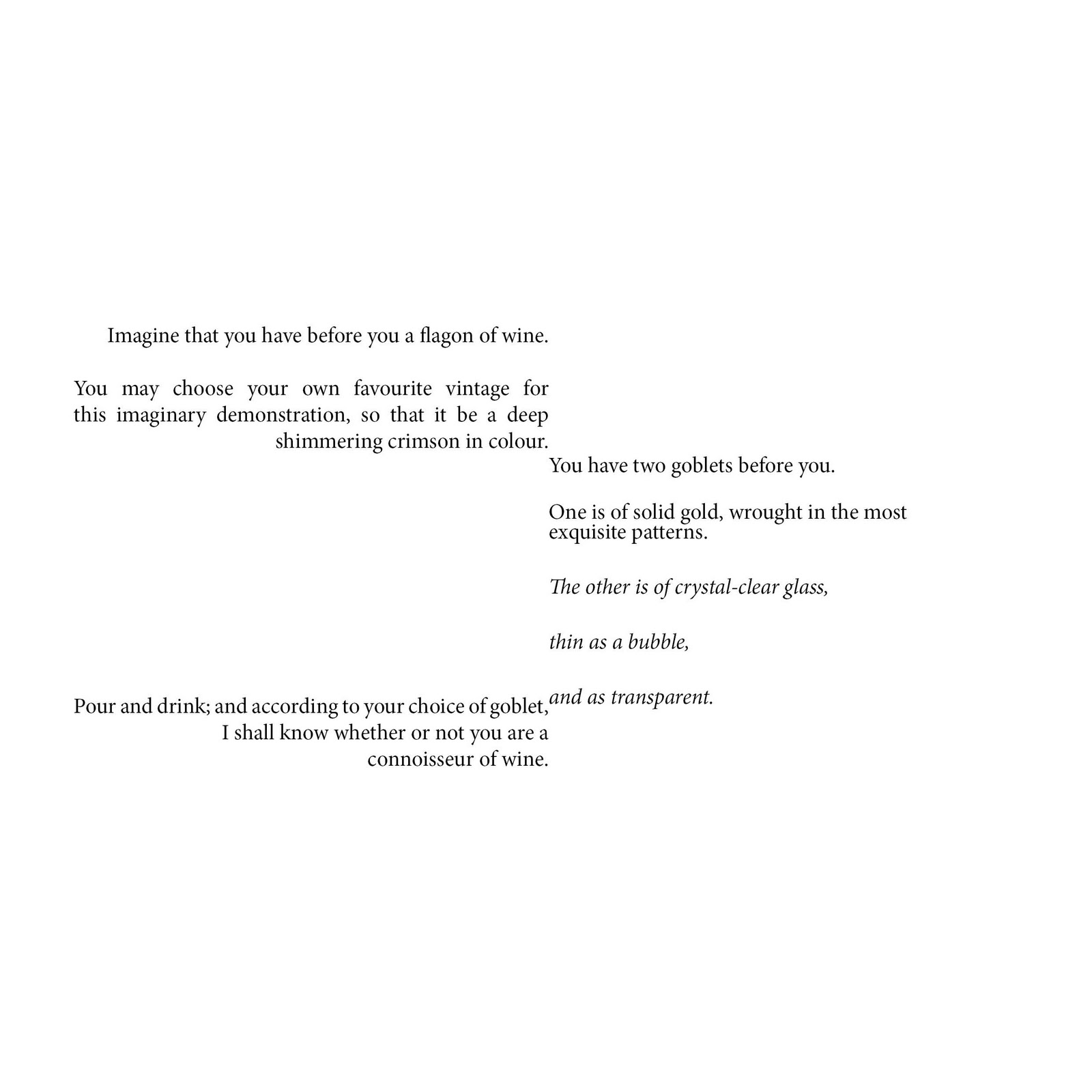
My response to the text: I both agree and disagree with aspects of the paper called ‘The Crystal Goblet, or Printing Should Be Invisible by’ Beatrice Warde. At times I do think writing should be invisible and unobtrusive, as Warde suggests, such as in a legal document where the information is the important part and it is essential that the message is accurate, but in other cases the text can sometimes be an element of the image or idea which a piece of work or print is trying to portray. For example in an advertisement the type may suggest a theme, degree of formality, or even humour. It might also give an insight into what the work or piece is about and should not just fade away into the background as the paper suggests. If the purpose of the piece of text is to give pleasure, for example a children’s story, rather than having a more functional purpose, then an aesthetically pleasing type might be part of the overall experience. Therefore I think the use of a certain typeface is completely dependent on its purpose, function and audience.  

Feedback: Leading in the second example has been fixed.


Monday 26 September 2011

A logo i designed

This is just a little bit of work I did for my mate a few months ago. He is a web designer working for a design studio called Mucky Puddle that is based in Glasgow (www.muckypuddle.com).  He asked me to design a logo for his own website which is called www.jasonliveshere.co.uk which he uses as an online portfolio and to gain business. Have a look on his website to see the logo in place as it looks better in context and also check out some of his work tooJ.

Just thought I would upload this as it uses typography which this module is all about. 


Inappropriate Font Usage

Firstly i would just like to say i dislike the logo for the London Olympics 2012 design by Wolff Olins. I think the colours are alarming and in your face and i don't think it really says sport? There are other reasons i dislike the logo and one being the type used. I think the type is very hard to read especially when you see it on a leaflet or hand out. I don't think it portrays the feeling of the Olympics either. The Olympics is a gathering and competition of the worlds greatest athletes and has been around since Ancient Greece. It is the worlds greatest sporting event and past logos and fonts used to advertise it have also represented the country which the games are being held at as it is a great pleasure and honour for that specific country to host the event. Therefore i think the font used should represent Great Britain, the history of the games, be readable and also have a capital L at the start of London. One typeface which i think could fit into this category is Gill Sans. The typeface is very readable. It was designed by Eric Gill who was British and it was made popular when used on the London and North Eastern Railway therefore giving it history to London itself. It is one of the most recognised typefaces today and its uppercase letters were modelled on historical Roman capitals therefore giving a slight relation to the games historical past.

After Feedback:
Some simple quick ideas how it may look if you changed the logo typeface completely but still stick to the designers originals layout and ideas. The grey area is there to simply allow you to see each idea a little clearer.

Friday 23 September 2011

Long List Exercise

Here is my long list exercise. After reading Enric Jardi’s book I tried to apply some of the tips he suggests within my poster itself. For example when I was creating hierarchy, I didn’t use too many categories (tip number 7), I only changed the pts size or colour. I also didn’t leave any words hanging (tip number 14) and no bold serifs were used (tip number 17). These are just some of the tips I incorporated into my design. When designing the poster I also used the same colour scheme as the book, which is orange, blue and black, to give a relation between the book and the poster and finally to give the poster movement and make it interesting I used the positioning of the number within the circle to lead your eye firstly down the left column and then back up the right column, therefore involving the viewer and not simply creating a normal top to bottom list. 


After Feedback:
The 'Penguin Book' look has been edited out. The text has some more room to breathe. And the design has been slightly simplified to relate again back to the original book. 


Hierarchy - Crime Blotter


This is an exercise where I have taken the same information and used it in three different layouts. I used visual hierarchy differently each time to change the focus of each piece.