Thursday, 17 November 2011

Rip it up and start again.


1. The info graphic is easy to understand as it is in a long strip format, which makes the reader move down the page one point at a time and this makes the information readily accessible. However the images alone do not allow the user to understand the information therefore they have to read the writing to find out what point is being made. The focus of the infographic is the usage of the website Stumbleupon, and this is made clear through the constant repetition and stats given about the website. At times too much information about other websites has been given which begins to distract the viewer away from the main focus, which may be a downfall.

2. All the stats on the poster were new to me and one which particularly surprised me was that Stumbleupon was used more than Facebook, as I had originally thought that Facebook was the most commonly used social media website. 


 The bar charts and the graphs facilitate the most learning as they are clear and we can refer to past knowledge to make a guess as to what they mean without reading the small print whereas the diagrams that are just pictures, for example the baby bottles, do need text to make them understandable.


3. The target audience would be a person or a company who are looking to create a webpage or social media page to benefit themselves or their company. Therefore the relationship would be that of a service provider trying to engage a consumer of the service. This infographic would be used to try to gain Stumbleupon business by showing stats about their website compared to their competitors and proving that their website offers better results. The designer targets and engages the audience by making Stumbleupon’s stats stand out. This is achieved by using a bright orange colour, and making the competitor websites a subtle colour to make sure potential customers focus on Stumbleupon the most.

4. There is use of hierarchy within this poster as the title has the largest type and the text which describes the graphics, is smaller in size. Subheadings have also been included at a size which is in between the title and the information, and the graphic around the subheadings helps them stand out and adds to the hierarchy. 

Heading

Subheading

 
Description 

The layout is in a long strip, which leads the user through the poster from top to bottom like a list. There is little use of white space, as the images and information come one after another to create the list effect.

5. The typography used is kept to a minimum and consists of small statements or sentences to get the point across clearly and quickly. 

 1

This keeps the viewer engaged and interested by not boring them with long paragraphs to read about facts and statistics. The text used is also fairly small in size compared to the graphics or images that it is describing to make sure the image is the focus and the text doesn’t distract too much from this. Hierarchy is shown through point size and colour change at certain parts of the poster and borders are added to subheadings, for example “STUMBLEUPON DRIVES OVER 50 PERCENT OF SOCIAL MEDIA TRAFFIC IN THE UNITED STATES” and “HALF-LIVES” to make them stand out.


Sans-serif fonts are used to again give a clean look to the poster, which will prevent the user being distracted from the images with fonts that are bold and have their own personality. All caps are used to make the information feel like headings for each individual graphic or image. (As shown in the above image: 1)

6. Some of the imagery used doesn’t add meaning to the poster, but is used to illustrate the facts in a visual way. For example the fact that the number of Americans born in a minute is eight doesn’t need the image of eight baby bottles to make it understandable but it does add a visual aid to engage the user and make the poster look more interactive and fun. The imagery used is also relative to the facts so when talking about time, a stopwatch is used and when discussing links, a chain with links is used. 


This link between graphic and information makes the poster more interesting for the viewer and also helps them to understand the information. The images used on the poster are therefore symbolic as the baby bottles symbolise the statistic of people being born and the stopwatch is symbolic of time, which is another statistic the poster is giving information about. The poster is mostly geometric through the use of bar charts, graphs and other images but there are also some organic shapes and images used, for example the symbol of the sun/day used when describing how long a link will last on a web page.


7. The poster’s main focus is Stumbleupon. The facts about Stumbleupon are in a bright orange colour to make the website the focus of the poster and immediately attract the viewer to their stats when they glance at the poster. The other colours used throughout the poster are subtler and tend to blend into the poster to make this the second thing the viewer will see and makes sure they don’t focus on these facts too much. The implication is that Stumbleupon is  bright and vibrant while the others are more bland and uninteresting.


8. The research content has been taken and put into bar charts and graphs to show the information visually but at times the images or charts do not give the viewer enough information, therefore they have included type to explain the images and make the stats absolutely clear to the viewer. They have also used logos such as Facebook, Twitter etc instead of just writing the words, which again allows the viewer to relate to it more quickly as they are used to seeing these logos on a daily basis.


9. The images and graphics are simplified to make sure the fact or statistic is still clear and not lost within the image and to keep the facts the main focus of the poster. They allow the user to see clearly what fact or stat the poster is showing, in a visual way, which makes it more interesting for the viewer.  The images, colours and layout reminds me of Jason Munn’s poster where he takes simple information and uses imagery to show or hint towards the topic. 


This makes it a fun piece to look at as you can understand the information quickly and easily without having to read too much. 

It is also suggestive of the New Typography movement and in particular Lester Beall’s public service poster, which promoted the use of electricity through the rural electrification administration in the 1930’s. His use of flat shapes and schematic drawing to convey the message with minimal use of text is also what this poster tries to achieve.


10.
- Sign up for the website and see how they work.
- Research the facts and work out which ones are relevant and need to be included.
- Work out what is the clearest way of showing each statistic or fact as an image. - Work out a colour scheme that will complement the website and also attract the viewer to the important information on the poster.
- Think of the psychology of colours and how people respond to advertising to portray the correct message about the company’s own website. 
-Work out the order and layout of all the information to make sure it is legible and not too cluttered and confusing.
- Choose a neat and legible typeface to use for the poster
- Work out the information hierarchy from the most important information to down to the least.
- Produce the poster and print.



Friday, 4 November 2011

How do I get there?

My morning starts with me leaving the house, half asleep and usually in a rush because I pushed for that extra ten minutes in bed, and jumping in my car. The drive in the morning is the worst due to the busy traffic and the never-ending turn after turn in the maze I call Cumbernauld. I speed into Tesco car park and leave my car in a space as I run up to the bus stop, or to be honest in this case it’s more of a fast walk as I am pretty lazy, especially in the morning. The wait at the bus stop, if you can call it that, is over pretty fast as I usually just catch the bus before the doors close in my face. Once on the bus I take my seat with everybody else and can finally relax as my bit of getting me to Uni on time over the responsibility is now the driver’s. The bus is the longest part of my journey to uni and in the latter half of this ride I usually tend to nod off or yawn extremely loudly, unless Liam is there to keep me awake. The bus usually pulls into Glasgow at about 8.55 allowing me to perfectly time my brisk walk up to Uni and make my class in what I call perfect timing, for 9.00 on the dot. 


The poster here is like a timeline starting with my house at the bottom and ending at the top with Uni. The blue background is to give the effect of how the mornings feel just now, cold and dark. The first part of my journey is the drive to Tesco and by using overlapping text and changing the angle of certain parts, I tried to create a hectic pattern to give the feeling I have every morning when in the car. I also wanted the pattern to look like tire skid marks to emphasise how much of a rush I am in. The waiting part of the journey is the shortest and hints at the idea of me shouting at the bus to stop before it leaves without me. The bus journey is shown through the sigh, which I let out when I finally get to sit down in a seat, and the curving nature of the text was to hint at the smooth journey the bus takes along the sweeping Steps bypass to get into Glasgow. Finally I used exclamation marks as if they were my footprints to show my short walk to Uni, which is just across the road, as my bus parks at Buchanan Bus Station. 


Wednesday, 26 October 2011

Helvetica


After watching the film Helvetica I learned a few new things. Firstly Helvetica was designed in 1957 and was originally called Neue Haas Grotesk which was an improved version of Akzidenz Grotesk. I also learned that Haas and Stemple Type Foundries are where Helvetica was produced and they were owned by Linotype who now owns Helvetica. When designing a type I also learned it is best to begin with a lowercase ‘h’ as it deals with curves, verticals and ascenders. Next move on to the lowercase letter ’o’ as this will deal with curves and counters and will allow you to see how it sits next to a vertical on the letter ‘h’. After this add a ‘p’ to assess descenders, curves and verticals again. Finally begin to make words to see how it will look in context when people read it.

A couple of things surprised me when I watched the film, for example how designers used to work before computers were incorporated into the design world and the amount of extra work they had to put in just to create a couple of layers within a design.  It allowed me to see how helpful the computer is when designing anything, but the main thing I was surprised about is that it was stated that “nothing bigger than Helvetica has came out in the last 50 years”.

Throughout the film one person who made me laugh was Eric Spiekermann. I generally found his personality humorous and enthusiastic. His actions and views made me laugh and in particular I found it funny how he prefers to “look at type than at a girl’s bottom”. 

The film itself had various designers I would like to learn more about. One person I would definitely like to learn more about is Eric Spiekerman, not only because he had a fun personality but because of his love for type. I enjoy working with type and I think his views and designs of type would be interesting to know more about as he described his work as “not perfect, but edgy” which I think sounds interesting.  Michael C Place is another designer I would like to know more about. He described how he likes to get an emotional response from his designs and this is something I hope my designs receive as well. The design company Norm also intrigued me as they like to work within tight design constraints to create simple but beautiful work which again is something I would enjoy doing and would like to do in the future. Wim Crouwel is someone I would like to learn more about. His desire for clarity and legibility within his work and also his clever use of grids and modernist ideas is something which I found extremely interesting and therefore I would like to learn more about his work. Another person who interested me, even though his work isn’t something I would typically do, is Stefan Sagmeister. I like the effort and enthusiasm he puts into his designs and they are interesting due to the hand drawn nature so even though I don’t usually design like this I would like to learn more about him.

The designers in the movie talk about the typeface in different ways depending on their view on it. Type is used to give words a certain mood, colouring and meaning. Type is also described as not the black marks on the page but the white space between the black letters, which make the typeface what it is and in some people’s views Helvetica is a perfect example of this. Massimo Vignelli states that type shouldn’t be expressive and Helvetica is a perfect modern example of this. He also states it’s more about the background and the spaces between the letters than the actual type itself. It is also stated within the film that feeling and emotion can be added to Helvetica simply by changing the spacing between the letters and Erik Spiekermann states that Helvetica is like air, we need it to breath.

I think the film itself will help me when talking about type in the future as I know that it is not just about the letters but the space and shapes they create. I will also be able to explain the emotions the type creates and the feelings I hope my work portrays. I would also like to be as enthusiastic and as funny as Spiekermann as he was excellent to watch and listen to.  

I personal still like Helvetica and would definitely use it within some of my designs. I love the shape of the geometric ends to the letters and also the counter white space within the letter ‘a’. The film has pointed out to me that the type is literally everywhere so I would definitely think about the white space when using it, to correctly create the feeling I was trying to portray within my designs. 

Tuesday, 25 October 2011

That font sure is saucy


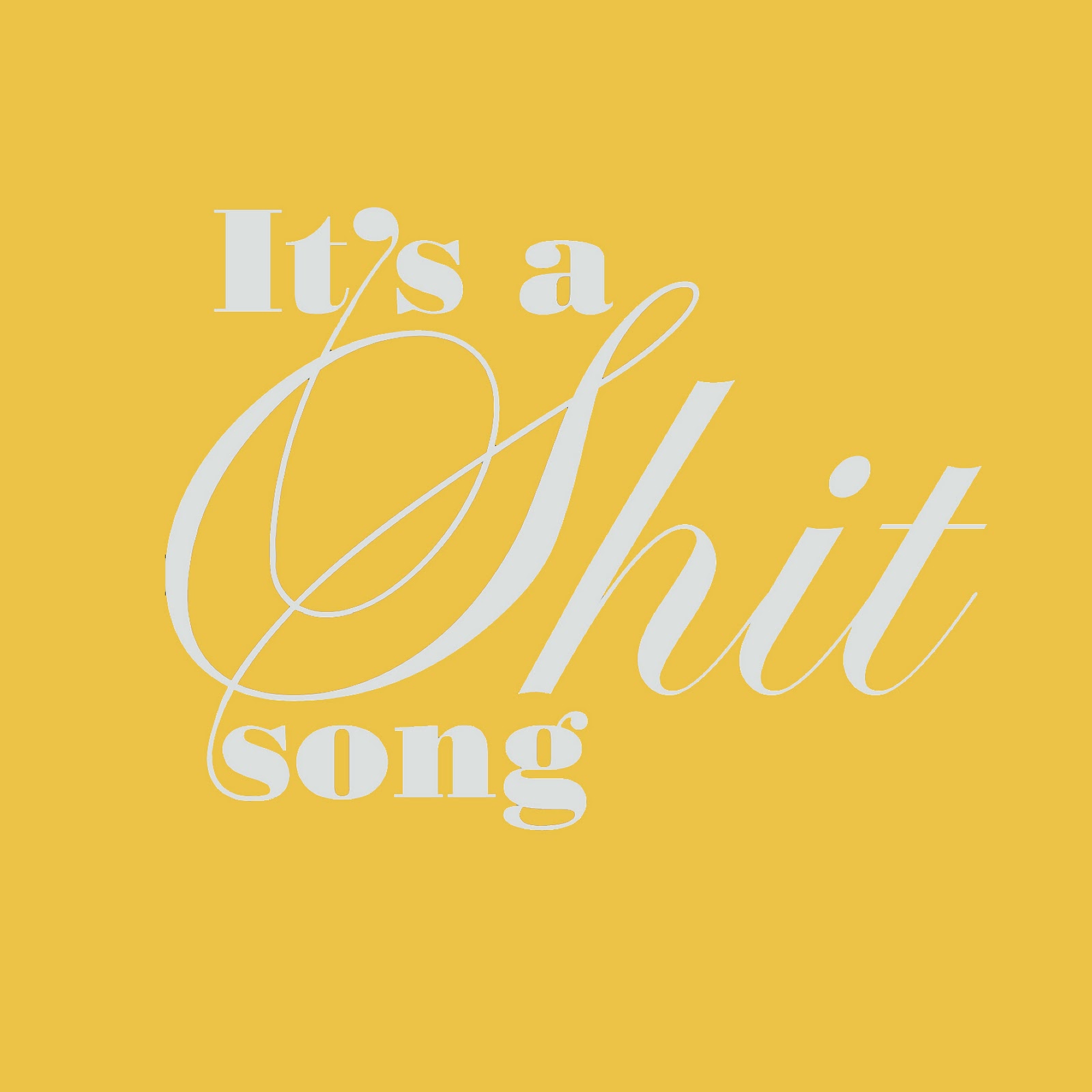
The first headline I have chosen to use was said by the cocky x-factor finalist Frankie Cocozza where he slates his song choice for the live show by saying, “It’s a shit song” when, to be honest, in my opinion, its not the song that is shit, it’s him!

I have taking this offensive headline and changed its connotations by making it look elegant. I used Bodoni and a Script font and added in some extra bits to connect the words and link the piece together.


The second headline I chose was “BRANSON LIFT-OFF” which is a story about Richard Branson and how he has opened the world’s first commercial spaceport. His spaceport is designed to allow people to travel to space as a holiday or trip.

I have taken this simple headline and done the opposite to the last headline. I have highlighted certain letters to make the headline become salacious and also created humour through the letters highlighted as people literally will be f******-off into space.


Tuesday, 18 October 2011

Getting Around


This is the ticket that I bought to get to Uni today. It was from the Stagecoach Bus Company and, to be honest, it is pretty horrible. The typeface used is sans-serif and is pixilated. This pixilated style is called a bitmap or raster font which means it is made up, on a computer, consisting of dots or pixels which in turn creates each character. These sorts of fonts when scaled up lose quality and are usually used when a computer's processing power is smaller in size. As this ticket comes out of a fairly basic machine this explains why this font was used, as the machines do not have the ability to print in fancy font or curved typeface. As a computer produces it there isn’t a historical reference but it does, in a wa,y fulfill its purpose by showing the correct basic information, which the ticket needs to show.


The ticket does show hierarchy and this is achieved through point size and perhaps boldness. The main information which stagecoach must think is important is in a larger, bolder point size i.e the price and the date, whereas the rest of the less important information on the ticket is kept to the same, smaller size. The information on the ticket doesn’t have any order and seems to be randomly placed about the page making it hard to understand unless studied for a while. The leading on the smaller information on the ticket is very small making it even harder to read. There also seems to be a random use throughout the ticket of all caps and mixed caps and lowercase for no apparent reason. I think other information such as the route and bus number should be made more prominent as these are important factors the bus driver would need to see when checking a ticket, if someone has bought a return.


This kind of ticket will be used on a day-to-day basis by a wide variety of people ranging from young school kids right up to old age pensioners. Students, teachers, business men, disabled people, old people will all need to use these tickets therefore it should be readable by all. Therefore I think it fails in fulfilling its job as a ticket as the very small writing may be hard for older people to read, the pixilated font may be hard for younger kids, people with visual impairments and again older people to read. The important information on this ticket should be readable at a short glance, making people's day easier and therefore less hassle would be caused worrying about having the correct ticket.

My Ticket Idea:


Here is my idea for a new Stagecoach bus ticket. As the ticket will have to be printed in large amounts I tried to keep the amount of ink that would be used to a minimum. I have also followed Stagecoach’s existing brand idea using their circle logo as an influence for the design. By using the stagecoach blue colour in the type I have also emphasized their brand identity and it also makes it more attractive compared to the bland, boring black text they use just now. I have also included a coloured main logo to show the company’s branding and this again makes the ticket that little bit more interesting. The typeface is Helvetica. I chose this typeface because it has already proven to work in the transport industry and is very legible meaning it could be read easily by all the users. Hierarchy is shown through point size and is emphasized by the circle design that I have used on the ticket. The amount of information on the ticket has been kept to a minimum and only includes the important information a person would need to know, and the information that the bus driver needs to have has been placed to the bottom and kept very small to emphasize the fact that this is for admin' use only. The layout of the ticket is easily transferable to other routes and buses as the design is very clean and simple. The bus number has been incorporated into the circle design but again this can be changed for other routes such as X24 and X37.

Thursday, 6 October 2011

Ampersand Blog Post


This is the ampersand I have chosen from the font Coming Together. The symbol is sans-serif and has a bold line weight. This thick line weight makes the symbol very full and gives it a solid appearance but on the other hand the smooth curves within the symbol do tend to soften the harshness of this effect. The ‘ET’ is very legible and the two letters join in a fluent smooth transaction. This makes the piece sit well as a whole and again emphasises its function as a joining word.

If this symbol was a person I think they would be a very happy person indeed. The symbol has a comic sort of look and creates a happy feeling. The smooth transition between the letters represents the person’s smooth talk and funny personality. This person would always want to be centre of attention as it is bold and stands out from the crowd. The joining of the letters and way they hug each other shows the person would have a caring sensitive side hidden behind this comical, in your face first impression.  

Wednesday, 5 October 2011

Modular Grid Exercise

This is an exercise where i have used a modular grid to arrange a body of text in different ways, each time with a different constriction.
  1. 1 size of type & flush left alignment only


2) 1 size of type, flush left and variable weights


3) vary the size of type but keep it flush left and one weight


4) anything goes